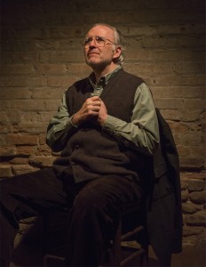
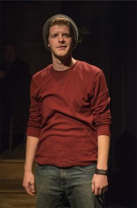
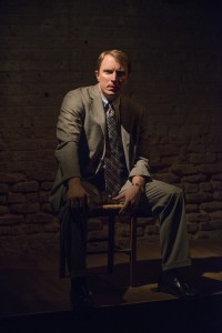
Lighting Designer Sarah Hughey returned to Writers Theatre this season for Port Authority after having designed Hamlet last season. Originally from Joplin, MO, Ms. Hughey now resides in Brookfield, IL. She obtained her MFA from Northwestern University and the first show she ever designed professionally was an opera showcase in Springfield, MO in 2000. She shared with us some information about her experience with Port Authority, providing insight into her design process.
What were your first impressions of this play?
SH: I was taken in by the characters and loved the structure.
 How did you first envision the world of this play from a design perspective? How has this changed during the process?
SH: I always felt like it was three guys in a public place telling their stories to real people, so the authenticity of the theatre at the back of a bookstore feels totally appropriate.
Have you ever designed an Irish play (by an Irish playwright or set in Ireland) before?
SH: Yes.
What surprised you most about this play?
SH: The connections between characters that emerge when you really examine the play closely.
What is working in the bookstore space like (compared to other places you’ve designed)?
SH: It is so dreamy and luxurious. The experience of making and watching plays in tiny spaces is so special, and to have that happening in a professional environment where that intimacy is the goal is just perfect.
If you were to pick 3 words or phrases to describe your design or that inspired your design, what would they be?
SH: Public space, shared experience, personal space.
How did your initial design ideas change over the course of the process of working on this production?
 SH: We always knew that the lighting would support the idea that we really are in a theatre in the back of the bookstore, and as we got into the space more I figured out how those light sources that support that idea can also be used to isolate and provide a source for a specific story within the piece.
What is your favorite piece/component of your design for this show?
SH: Every time I’m able to use a “real” light from the space for a story moment, like the emergency lights that pop on during Kevin’s story about the house party, I just get a little thrill.
Did you have any discoveries/interesting struggles/surprises while designing this show? What were they?
SH: It was fun discovering that there could be rules, like how we either include or ignore the presence of the audience, and then totally decide to break those rules if the decision feels right.
Have you worked with William Brown as a director or these other designers before? How would you describe your collaboration with them?
SH: I’ve never worked with Bill before. I really enjoyed the process from the very beginning, when he would gather the whole team for a meal with the sole purpose of just talking and talking about the play.
What do you hope your design conveys to the audience? 
SH: I hope the audience feels that they are sitting in a theatre in the back of a bookstore in Glencoe, and that they don’t even notice as that space recedes around them and they fall into these three stories.
What will you remember most about your experience designing this show?
SH: We had the most incredible design meeting for this show that I will always remember. We sat in this bookstore’s backroom, with scenic designer Martin Andrew going around and literally touching every wall, and leading a fantastic discussion about what that wall was, what its history was in this building, what its history was to Writers Theatre, and what of that is the most important thing to find or see for this play.
We feel very fortunate to work with excellent designers like Sarah Hughey. For more examples of Ms. Hughey’s design work, we encourage you to check out her website and the photo galleries of Port Authority and Hamlet.


No comments yet.